The increase in time spent on mobile
Today the use of mobile is more and more widespread in the world. 79% of people use their smartphone to read their emails, but 70% of them delete them if they are not adapted to their screens. It is therefore important to keep in mind for your website that there are more mobile Internet users than desktop Internet users.
It is estimated that mobiles are expected to represent more than half of global Internet traffic, and that 45% of e-commerce will take place on mobile. It is for these reasons that it becomes essential to offer a site adapted to mobiles if we want to satisfy our customers.
The multiplication of digital media and Google’s consideration of responsive design
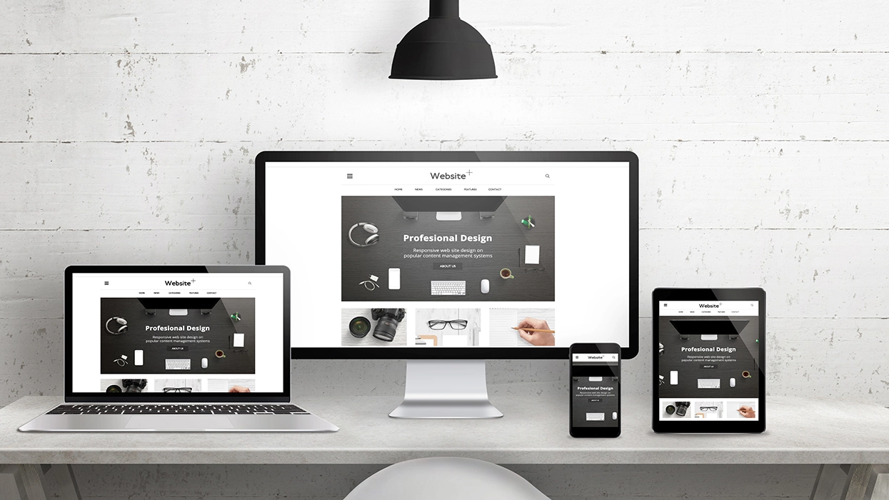
It’s not just mobile usage that’s spreading. Diversification of digital media is booming in Canada, and around the world. Today it is common to have several digital devices (desktop, laptop, tablets, smartphones, etc.). It is inevitable that visitors to your website will access it through different screen sizes. It is therefore crucial that accessibility is simple and thoughtful for each medium.
Google’s algorithms, which analyze websites and then index them, adapt to new trends. Nowadays the user experience called UX, takes an important place on websites. With the proliferation of digital media, Google considers responsive design as a key point for SEO. It is also good to know that the choice to have a single URL will allow you to share content with any Internet user.
For example, if your site is not responsive and a person on desktop shares a web page with a friend who wants to open it on his mobile, the content will not be adapted. He then risks not being interested in the content and therefore having a bad user experience. Having a responsive site has direct consequences on your positioning on search engines.
Customer engagement
Nowadays, Internet users are solicited by all types of digital content. So if they are offered content where the visualization of the pages is complex, this will have a negative impact on customer commitments. On the other hand, if the visitor to your site does not encounter any difficulty in reading or viewing, this will positively influence their opinion of your site and therefore, on customer conversion. You should know that the number of online forms filled out on mobile phones is on the rise. It is therefore important to be certain that the design is clear and appropriate. The ideal is to use a responsive site to improve customer engagement.
Simplify the management of your website
Previously, we mainly stated the advantages for users but let’s not forget the integrators! With a responsive design, there is only one simple URL to manage and update. We then work on a single file. This administration will save you time in the creation and publication of website content.
Responsive design is essential to adapt to each type of digital medium and to ensure good referencing on search engines.